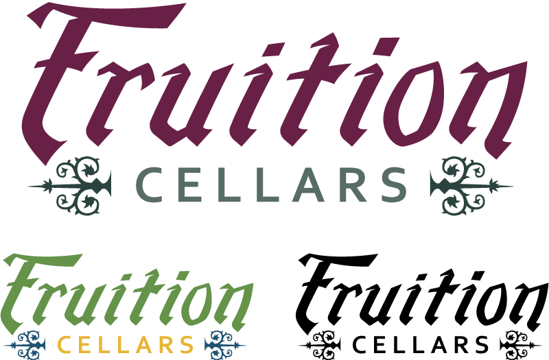
The logo design was created to serve as the building blocks for the rest of the branding needed for the wine maker. Since the background of the wine originated from family recipes, the idea was to have a hand-crafted feel to the design. With that in mind hand lettering seemed to be an appropriate approach. Influenced by the variation in strokes with calligraphic penmanship, the letterforms were design to reflect how a traditional quill pen and ink would look with a few small details to help enhance the hand drawn style, such as the small negative space between the top horizontal strokes and the top of the vertical stems in most of the characters. The small details on either side of the word ‘Cellars’ are representative of decorative door hinges.